Sunday, June 21, 2009

Final UT Environment


Barack Obama's Office


The design for Barack Obama's Office is very enclosed for being in his status, he needs to be protected at all times and the discussions that occur within his office need top be protected from the wider community. Also there are a number of levels before Obama's table is reached, this suggests the level of hierarchy between the President and his staff.

Miuccia Prada's office


The Design Miuccia Prada's office is spacious and welcomes the outside into the workspace. Prada likes the workspace to have be part of the outside so that employees do not feel they are not in a typical office environment and also, so that they staff can be inspired by the outside world. Therefore, i designed an outside courtyard for Prada and the staff to interact their ideas and with clients in fresh air. Also, Prada's office has a runway for when new designs need to be shown to Miuccia Prada, staff and buyers.

The Meeting Room


Final UT environment - Filefront Upload

Filefront was not working, so i put it on rapidshare

Meeting Rooom Table


The table I designed is to portray a struggle of power between clients. In the top view of the table, it suggests the ideas being suggested by the clients are being 'pulled' wither ways therefore, a struggle in power. But there is still a part of the table in the middle that is connected shows that there are still ideas by the powerful clients that they come to agree on. This is also suggested by the tables being giving the perception that the table can slide back together meaning a join of powers.

Miuccia Prada's Elevator


First Design


This first design that i had created for Prada was inspired by the brands clothing line where it is high fashion and elegant and contemporary. With this in mind i wanted to create an elevator that had style, elegancy, modern and an organic aspect to it. Therefore, I used glass to give it the contemporary aspect and the texture i chose to use is very organic.


Second Design


With the second elevator I designed for Prada, i had come to an understanding the fashion work is such a fast pace industry. With styles being updated continually and even the fast moving pace of a fashion show. Thus, I created this second design for Prada that is more open and not as enclosed as the first design. With it being an open plan the client and people working for Prada can easily access the elevator while working in a distinctly fast industry.

Barack Obama Elevator


The Design I have chosen for President Barack Obama's elevator is one that is bold and strong. The shape is large straight angles to portray a strong strength of power as it comes with his status. It is a quite large elevator for the president would always have a large entourage with him at all times for different purposes. Therefore, they can all exchange information while travelling.

Monday, May 18, 2009

Two-Point Perspective Drawings


Mashup


Ms. Prada has distinguished herself with her eccentric and unconventional uses of pattern, shape and (often high-tech) fabrics. He is the first African-American to ascend to the highest office in the land. He is also the first new president since terrorists attacked New York and Washington on Sept. 11, 2001. Her avid explorations into pop cultural realms few designers navigated as boldly and her provocative relationship to the traditional markers of femininity in dress. There are Madonna moments in her tour documentaries, when she refers to herself as "the boss" and "the queen" when talking with her crew and dancers. More than her formal experiments with style, it is her engagement with the mutating outlines of class that make her one of Italy’s most compelling cultural exports. The first to use the Internet to decisive political advantage, the first to insist on handling a personal smartphone while in the White House.  She not only stole the show but, nearing fifty and wearing a leotard, still managed to be the best-looking woman on the stage that night.


Sources:

http://topics.nytimes.com/topics/reference/timestopics/people/o/barack_obama/

http://www.rollingstone.com/artists/madonna/articles

http://topics.nytimes.com/topics/reference/timestopics/people/p/miuccia_prada/index.html

UT: Draft


Draft 1


Filefront Upload:
Draft 2:


File Upload:

One-Point Perspective Drawings


Monday, May 4, 2009

Lecture


This image from the lecture I find similar to the style that I have been drawing in my notebook and have been designing on unreal tournament editor. In this image I can see there is a large amount of space inside which is an attribute that I like and try to integrate in my own style for the clients. Large space is an important aspect to the clients for they have such a broad range of ideas in which they need an environment that they have a large amount of room to execute their creativeness. Another aspect of the image that I want to highlight in my on unreal tournament design is the lighting and shadows. I believe in this image they have successfully used the aspect of lighting and shadowing to highlight specific areas of the structure.


Electroliquid Aggregation

Original Quotes:

"If I have a thousand ideas and only one turns out to be good, I am satisfied."

"A lot of people attack the sea, I make love to it."

Electroliquid Aggregation

" If I have a thousand ideas, a lot of people attack it, and only one turns out to be good, i make love to it"

Final Developed Model


This final developed model portrays the area in which Alfred Nobel and Jacques-Yves Cousteau can create marvelous items to their imagination. For Alfred Nobel i have created an area in is enclosed so that most of his work can be created in an environment where there are no interruptions of the outer world as he he has 'a thousand ideas'. On the other hand,  the area i had created for Jacques-Yves Cousteau is an open area where he can be with nature. "A lot of people attack the sea, I make love to it." reveals to me that he is a man that likes to be outdoors and embraces natures. Thus, the space and environment that was created for him is outdoors so that he can be easily inspired by what he loves.

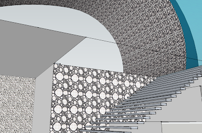
The ramp created for Nobel to reach the meeting point is ramp that is stair-like and made up of different sizes and shapes which reinforces that many ideas that Nobel has. The texture used on this particular ramp is one of many busy lines, again emphasising the many different ideas that are running through his head. Conversely, the ramp created for Cousteau is one that enters the meeting point building but still has the openness of nature. That is there is no roof and nothing beneath the ramp, making it stil part of nature even though inside the meeting point building. The texture used in this area was inspired by nature and forest areas where vines are intertwining. Therefore, that is what the texture is illustrating by the amount of lines running everywhere and this reflects Cousteau's passion for nature.

36 Texture - Light to Dark

Drafts on ut editor


Monday, April 6, 2009

Client Quotes


Alfred Nobel

"If I have a thousand ideas and only one turns out to be good, I am satisfied."

Source: http://www.firstscience.com/home/poems-and-quotes/quotes/alfred-nobel-quote_2251.html

Jacques-Yves Cousteau

"A lot of people attack the sea, I make love to it."

Source: http://www.brainyquote.com/quotes/quotes/j/jacquesyve204393.html

Keith Campbell

“The ability to recreate an individual by cloning has long been the substance of science fiction.”
Campbell, K. (1998). Look on the bright side of cloning. Nature Medicine. 4 (5). pp557-558.

Wednesday, April 1, 2009

Final Model on Google Warehouse


Animation


Final sketchup model


My Final sketchup model is designed with the inspiration of large space for it being an exhibition gallery. I have created the different level with high ceilings and large spaces with large stairs cases for easy transportation of artworks.

The Textures Integrated


Note: Commented on Tri's blog page in Shaowen Wang's group

18 Sections